Blog
Hulk fan art – Digital illustration by Zuniga
A digital illustration by Zuniga inspired about The Hulk is a fictional superhero appearing in American comic books published by Marvel® Comics. I sketched a hand-draw on regular paper and then used a pointillism technique with stylographic pens on Canson® paper; finally, I used Illustrator® and Photoshop® software for coloring the artwork digitally.
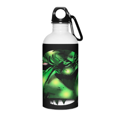
A collection of Hulk’s products designed by Zuniga
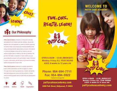
Logo design and marketing support for Patty Cake Academy
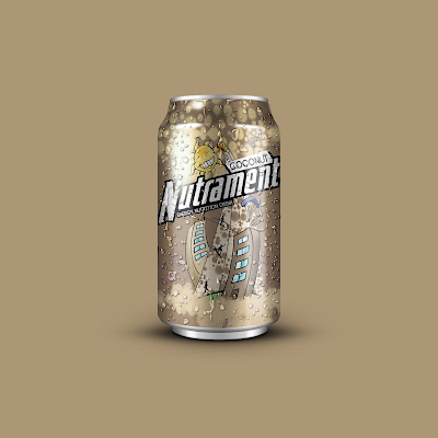
Label design for Nutrament. Fuel your now
Nutrament is a nutritional vitamin drink brand. Whether you need a drink to fuel your game or just one for a quick snack Nutrament lets you make the most of your day.
Details:
In these proposals for the new label design, I tried to capture an urban and energy essence for their new brand personality. The design of labels is vibrant and colorful.
Also, it has a color by flavor.
The hand-drawn is simple and authentic; it has movement, and the tone in art is contrasting and dramatic. The spot that stands out in the artwork is a sporting life.
Idea:
When conceptualizing the label design, I kept the “color by flavor” system for its products. As you can see, the packaging for every flavor has different colors while maintaining the same consistent design.
Brief:
Primary target audience: urban, male, typically Afro/Hispanic Caribbean.
Copy: Energy Nutrition Drink.
Tagline: “Fuel Your Now.”
Flavors: Vanilla, Chocolate, Strawberry, Banana, Coconut, and Mango.
Nutritional information:
• 16g of protein
• 35% daily value of 24 vitamins and minerals
• Made with real skim milk
• Excellent source of high-quality protein, calcium and vitamin D
Credits:
Brand: Nutrament
Project: Proposals for a new label
Topic: Sporting life
Entry type: Paper wraparound label.
Software: Adobe Illustrator & Adobe Photoshop
Illustration: Marco Zuniga
Graphic Designer: Marco Zuniga
Digital Artist: Marco Zuniga
Motion Graphics Designer: Marco Zuniga
Presentation:
Color by flavor:
Coconut, Mango, Strawberry, Chocolate, and Vanilla.
Flavor collection:
Branding:
The color of the brand by flavor:
Artworks:
Nutrament template: Diecut
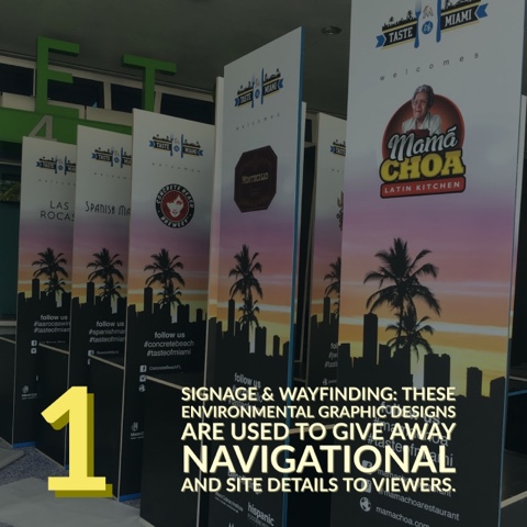
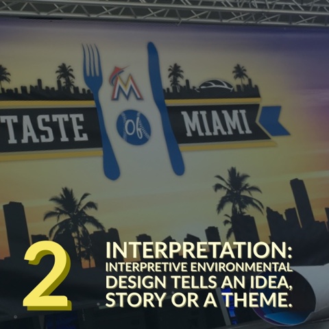
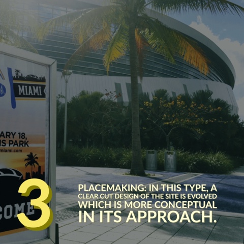
Environmental graphic design: steps
Chef Adrianne Calvo | Branding
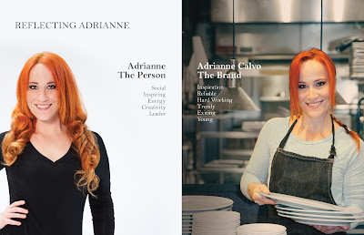
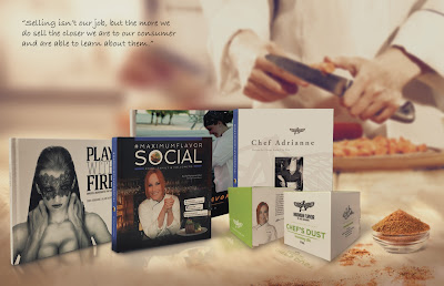
The chef Adrianne needed to unify her products with her main brand. First, we needed to look at the main points of interest for her brand, write down the brand guidelines including a photo shoot proposal, a look and feel; brand essence, and marketing support samples. We produced consistent perceptions images that clearly communicates the company’s persona.
Introduction: Fast Facts
• In 2015 Yelp included Chef Adrianne’s in their top 50 local, non-chain Miami eateries.
Before that both Miami Magazine and Urban Spoon named in the Best Restaurant Miami in 2013.
• Featured on NBC “6 in the Mix” every Thursday as the Panda Kitchen Ambassador and a guest chef.
• “Make it Count” Foundation to benefit children and their families.
• Cookbooks: Maximum Flavor (2005), Chef Adrianne: Driven by Flavor Fueled by Fire (2008), #MaximumFlavorSocial (2014) and Play with Fire (2015).
Credits:
Agency: GMG Advertising
Advertiser: Chef Adrianne Calvo
Site: http://www.chefadriannes.com/
Category: Personal Brand Identity
Chairman & CCO: Mike Beovides
Senior Account Manager: Jennifer Rangel
Account Executive: Erica Martin
Concept Art Director: Marco Zuniga
Graphic Designer: Marco Zuniga
Photographer: Ines Diaz
Table of contents:
WELCOME
• About Chef Adrianne
• Reflecting Adrianne Calvo: The person – The Brand
• Our Values
• Brand Essence
• Brand Strategy
Maximum Flavor | Events | Make it Count | Adrianne’s Collection
ADRIANNE
Adrianne’s Lifestyle: Imagery
• Travels
• Family & Friends
CHEF ADRIANNE CALVO
Chef Adrianne’s Lifestyle: Imagery
• Travels
• Professional Associations
Vineyard Restaurant: Photography
• Fellow Employees
• Love Letters to a Chef
• Chef Adrianne Collection
Online community: Facebook – Twitter – YouTube – Instagram
@chefadriannecalvo
MAXIMUM FLAVOR
• Design Essence
• Naming
• Typography
• Logotype
• Sizing / Color Usage / Color Palette / Brand Colors / Secondary Colors
• Application
• Adrianne’s Signature
• Art Elements
• Marketing support
38,575 Thanks! Total Pageviews – 2016
More than 38,575 views – Blogger
http://emezetacreativo.blogspot.com/
Yell. Always at its fingertips. Print
Advertiser: YELL
Medium type: Print
CEO: Fernando Fascioli
General Creative Directors: Mauricio Fernandez-Maldonado – Ricardo Mares
Account Executive: Tatiana Mosquera
Art Director: Marco Zuniga
Copywriter: Pablo Velasquez
Original tagline: Lo que tu empresa necesita, siempre a la mano
Translation: What your business needs, always at its fingertips
A+ MiniStorage. Rhinoceros & 3D letters -Proposals
Recent Posts
Archives
- February 2020
- November 2019
- October 2019
- August 2019
- September 2018
- August 2018
- June 2018
- January 2018
- December 2017
- November 2017
- July 2017
- May 2017
- January 2017
- December 2016
- November 2016
- October 2016
- September 2016
- August 2016
- July 2016
- June 2016
- March 2016
- February 2016
- January 2016
- December 2015
- November 2015
- October 2015
- August 2015
- March 2015
- February 2015
- December 2014
- November 2014
- August 2014
- June 2014
- May 2014
- April 2014
- March 2014
- February 2014
- January 2014
- November 2013
- October 2013
- September 2013
- August 2013
- July 2013
- May 2013
- March 2013
- February 2013
- December 2012
- November 2012
- September 2012
- August 2012
- July 2012
- May 2012
- February 2012
- December 2011
- November 2011
- October 2011
- August 2011
- July 2011
- June 2011
- May 2011


















 View stream on Flickr
 Mark Zuniga on Blogger
Recent Comments